
Luxury Wellness & Gifting
Sacred Space
Brand strategy, visual identity, and packaging for a luxury spiritual wellness brand.
- My role
- Brand lead — strategy, identity, packaging, copy, web
- When
- From June 2020
What came of it
revenue at launch, across product and website
The brand was retired in a rebrand about a year later. The provenance score worked as an idea, but the client's margins didn't hold it.
The brief
Two founders launching a premium candle and ritual brand into a category where every competitor says the same things about intention and calm. It needed to justify a luxury price next to Aesop and Bamford, and it needed something concrete to say beyond a feeling.
What I did
- Ran the in-person brand kick-off with founders Jessica Ince and Dickie Cohen in June 2020
- Wrote the strategy: vision, mission, values, tone of voice, and two full customer personas — 'Victoria' and 'Nicola' — mapped across demographics, lifestyle and shopping behaviour
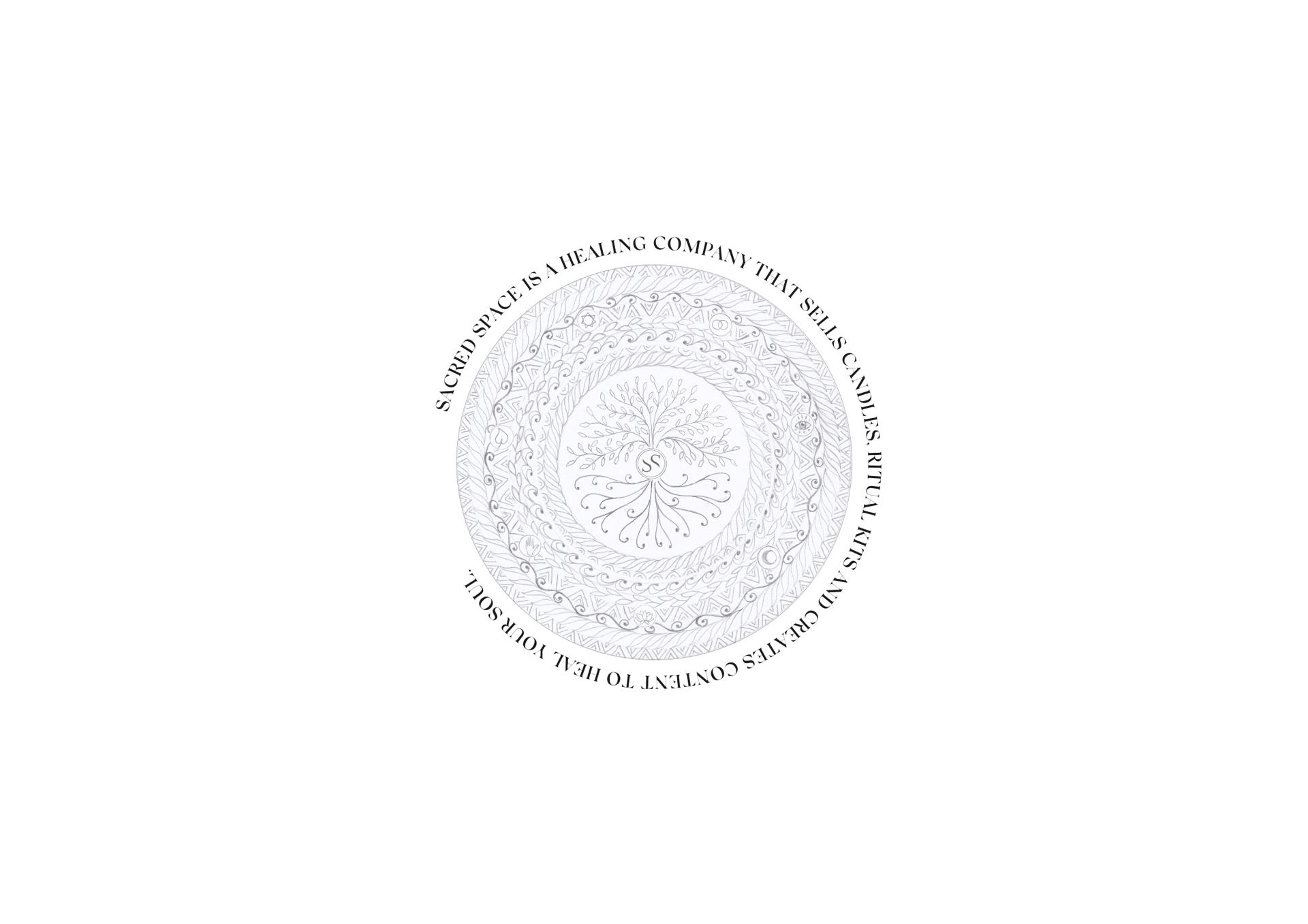
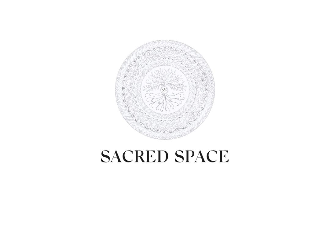
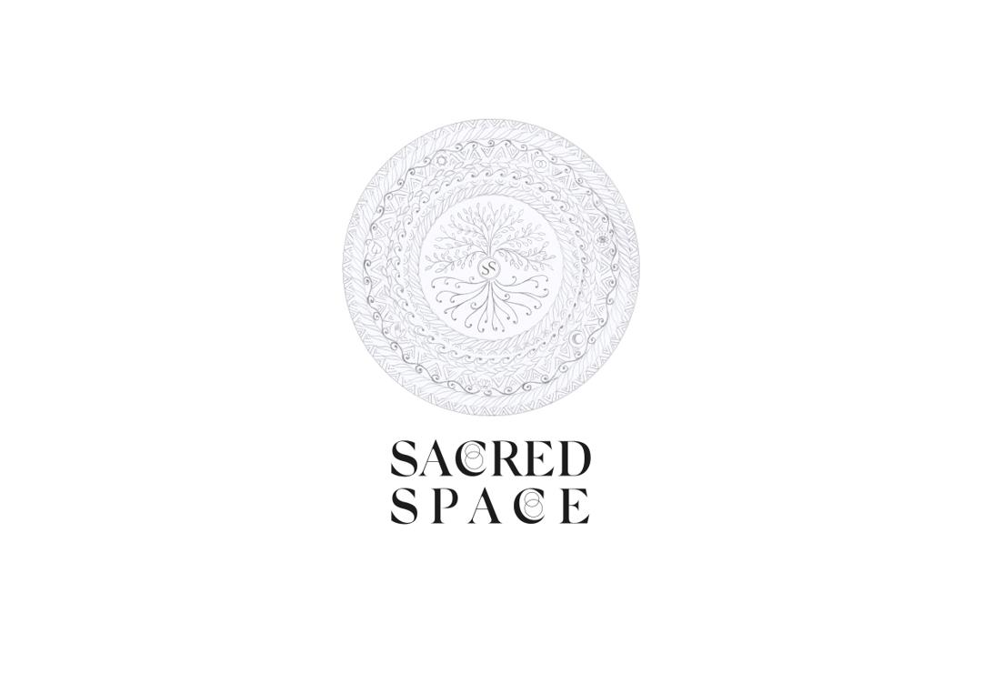
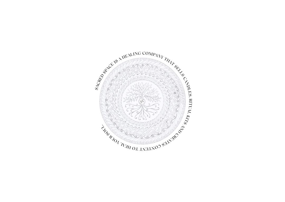
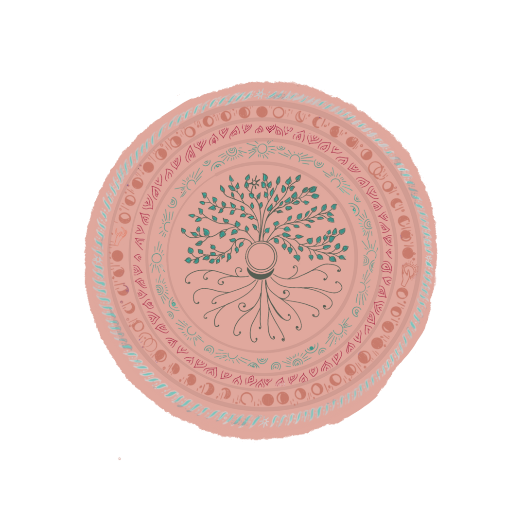
- Explored two style directions, minimal and symbolic-boho-chic, then worked through roughly 70 logo iterations before the mandala/tree emblem was right
- Proposed and designed the provenance score — a per-product rating covering ingredient distance, sourcing and environmental impact, giving the brand a verifiable claim rather than a mood
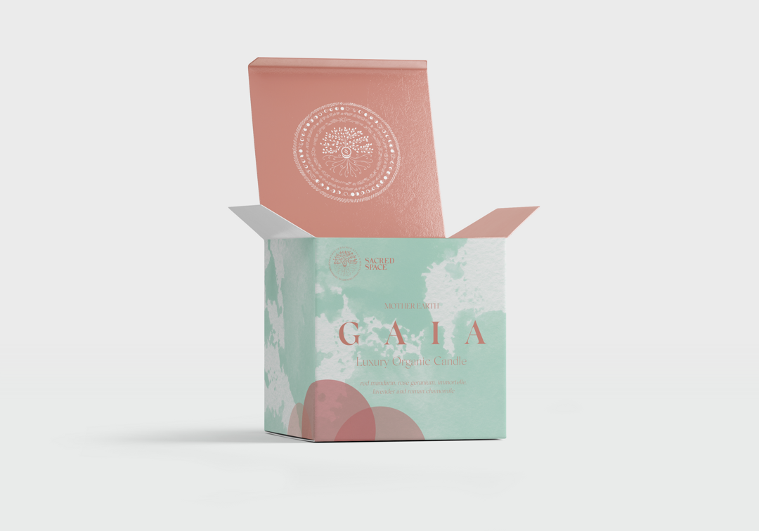
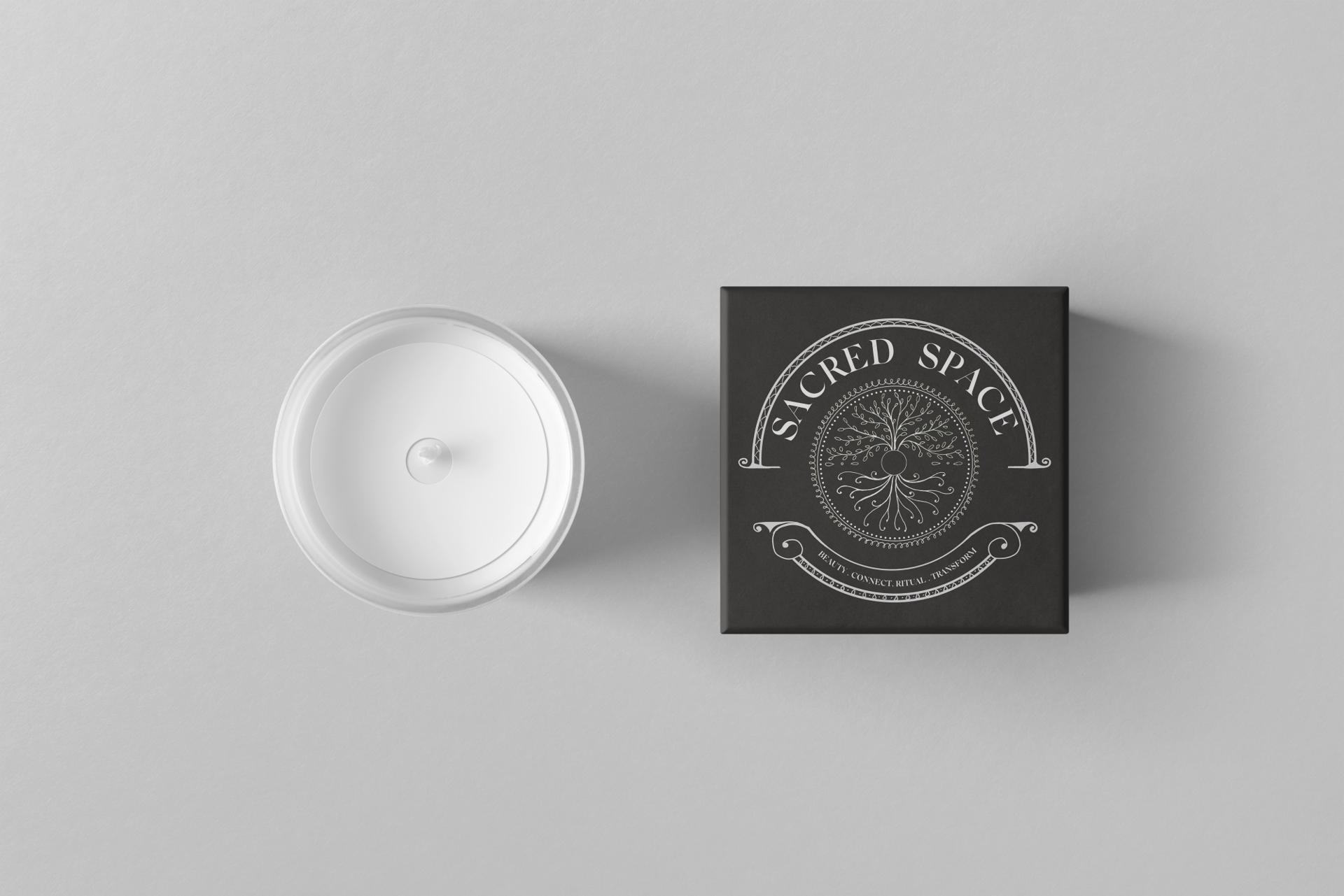
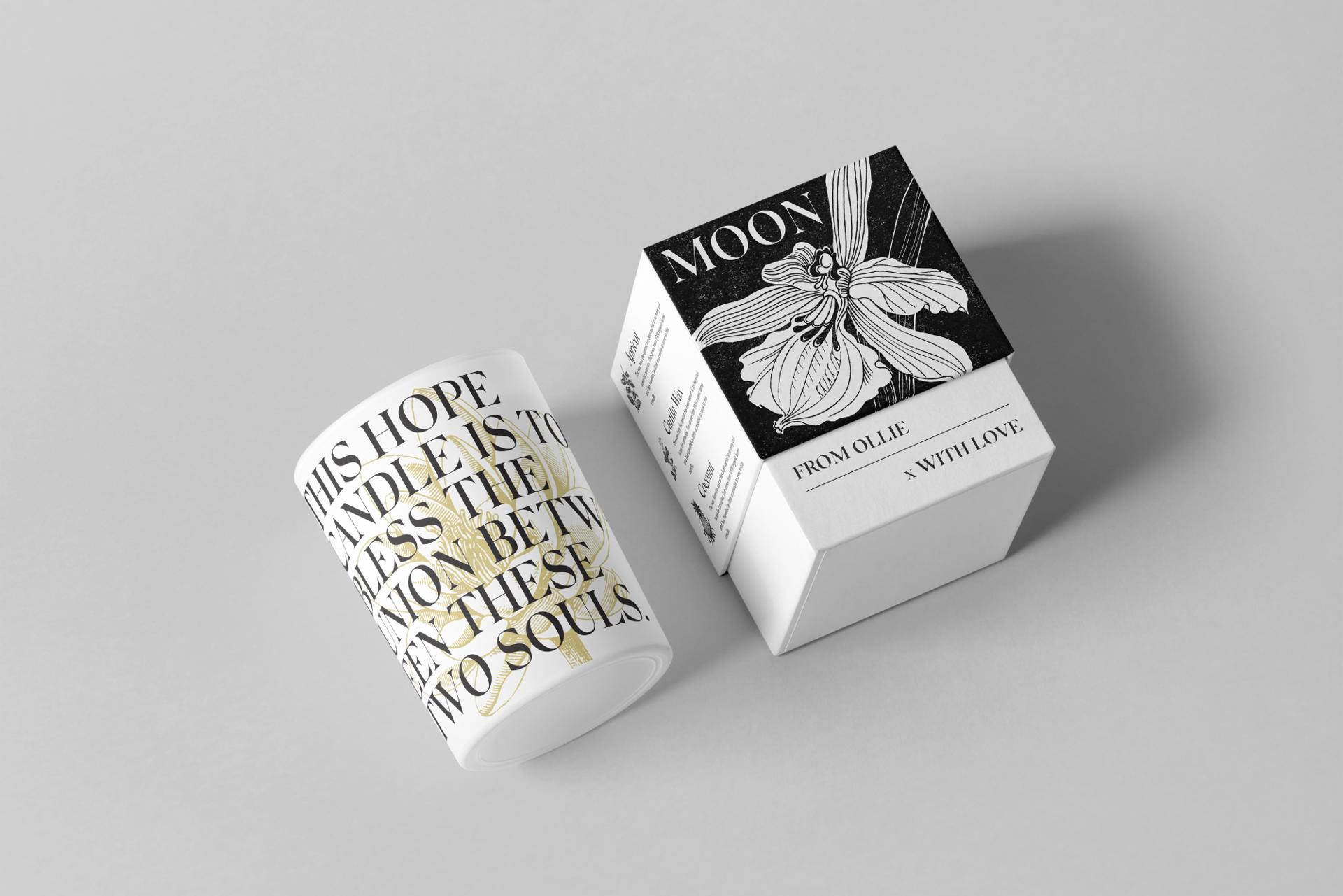
- Designed the packaging system and the web presence
- Wrote the brand copy
- Produced nine versions of the brand guidelines and several hundred social assets across the engagement
How it went
Sacred Space is a spiritual wellness brand — candles, ritual packs, and experiences built around provenance, intention, and care. I joined founders Jessica Ince and Dickie Cohen in June 2020 for an in-person brand kick-off, and from there developed everything: strategy, positioning, visual identity, packaging, and web design.
The brand needed to live in the overlap between luxury gifting and spiritual practice — premium enough to sit alongside Aesop or Bamford, personal enough to feel like it came from people who genuinely believed in what they were making. Two style directions were explored — 'minimal' and 'symbolic-boho-chic' — before the brand committed to an identity built around a mandala/tree emblem. Getting there took around 70 logo iterations.
The strategy work was detailed: vision, mission, values, tone of voice, and two full customer personas — 'Victoria' and 'Nicola' — with demographics, lifestyle habits, and shopping behaviour mapped in depth. Good brand work always starts with a clear picture of who you're talking to.
One of the most interesting creative decisions was a 'provenance score' on every product: a concrete mechanism that rated how far each ingredient had travelled, how it was sourced, and its environmental impact. It was an unusually honest and specific commitment for a wellness brand, and it gave the brand something real to say — not just a feeling, but a standard.
What I'd do differently
This is the project I'd run differently. Roughly 70 logos, five or six moodboards, several hundred website changes, several hundred social assets, nine versions of the brand guidelines. Scope creep at every stage, and I let it happen.
What I'd change: spend far longer getting the client genuinely confident on the brief before starting. Over-communicate the steps involved in a launch rather than assuming they're understood. Produce fewer, more targeted assets. And spend real time defining what the website was for, rather than designing it and finding out.
The work stands up. The way I ran it is the part I've since fixed.