
Health & Wellbeing Tech
Mental Fitness Hub
Brand strategy, identity, and full web UX for an Australian mental fitness platform.
- My role
- Brand and UX lead — workshop facilitation, identity, web design
The brief
A Melbourne venture selling mental fitness programmes into organisations, with two founders who had a proposition but no agreed language for it. The buyer is an HR director, so the brand had to read as credible to a business audience while staying distinct from clinical mental health services.
What I did
- Facilitated the brand kick-off workshop with Director Nichole Walker and General Manager Michael Mealy to settle vision, audience and tone before any design
- Landed the positioning distinction — mental fitness, building capacity, rather than mental health treatment — which then drove every copy and layout decision
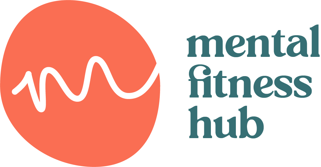
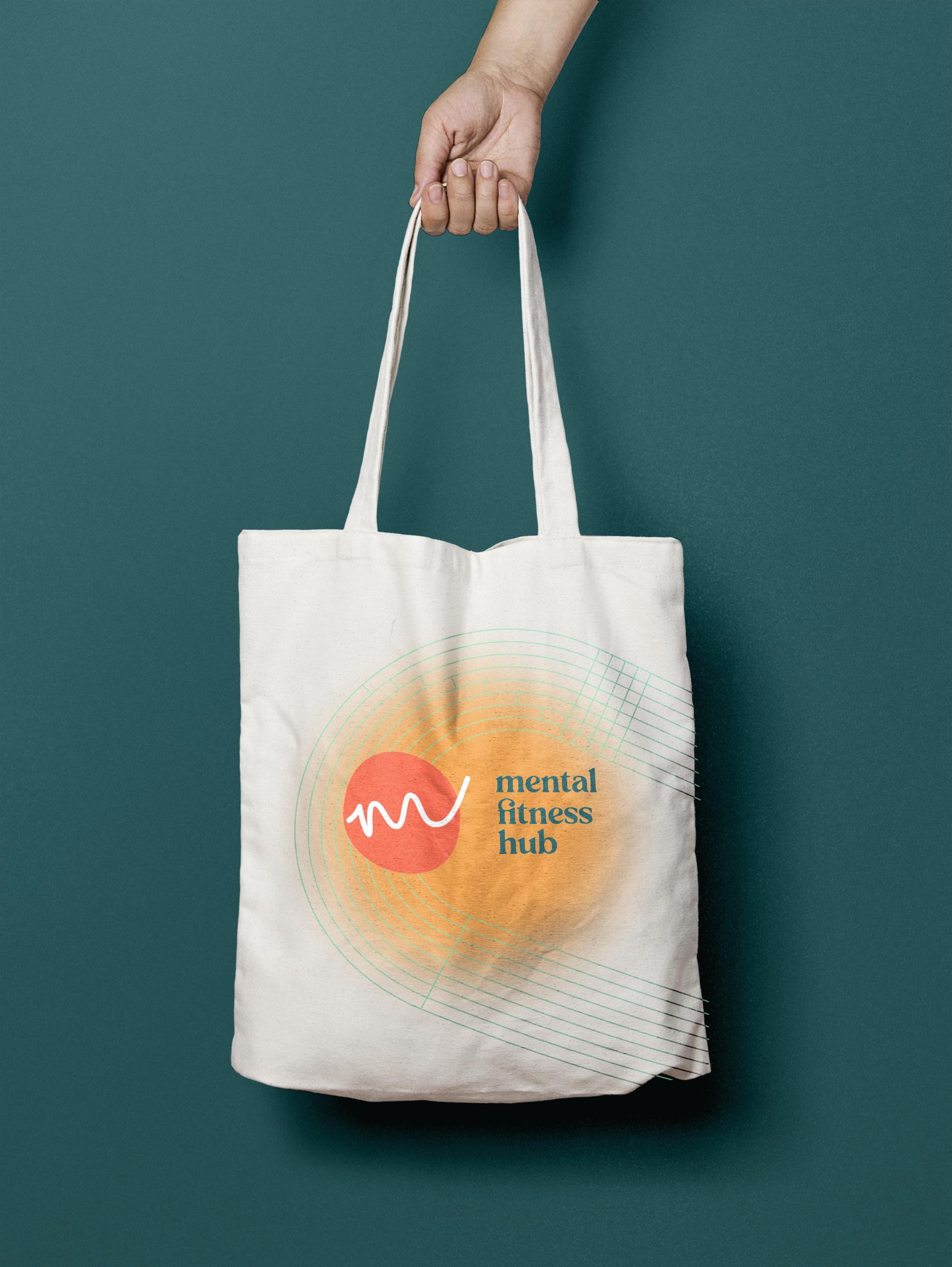
- Designed the identity: wave mark, sans-serif wordmark, and a teal and coral palette chosen to read calm without reading clinical
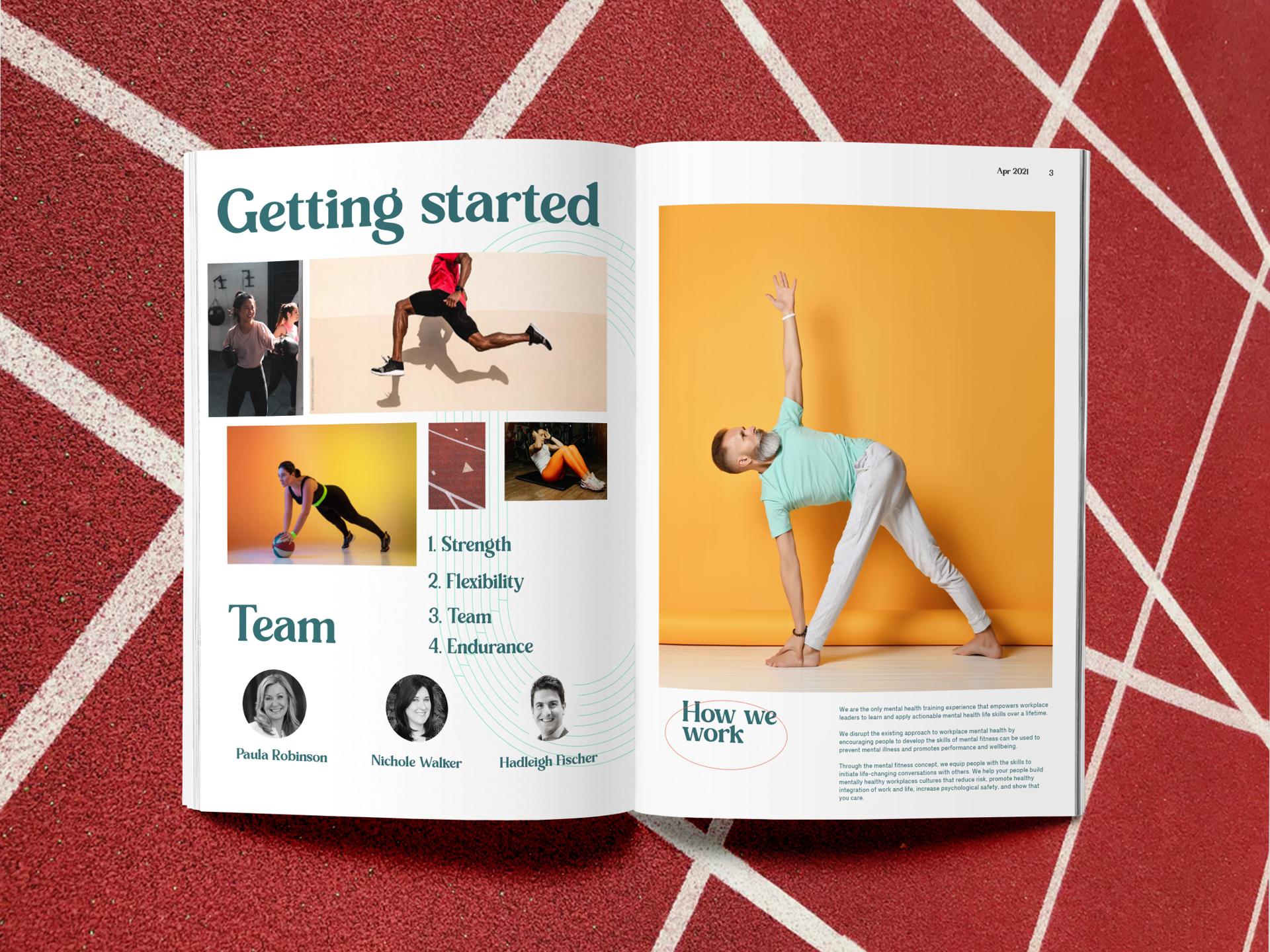
- Built brand guidelines in multiple formats so they worked in Keynote, PowerPoint, or straight to a developer
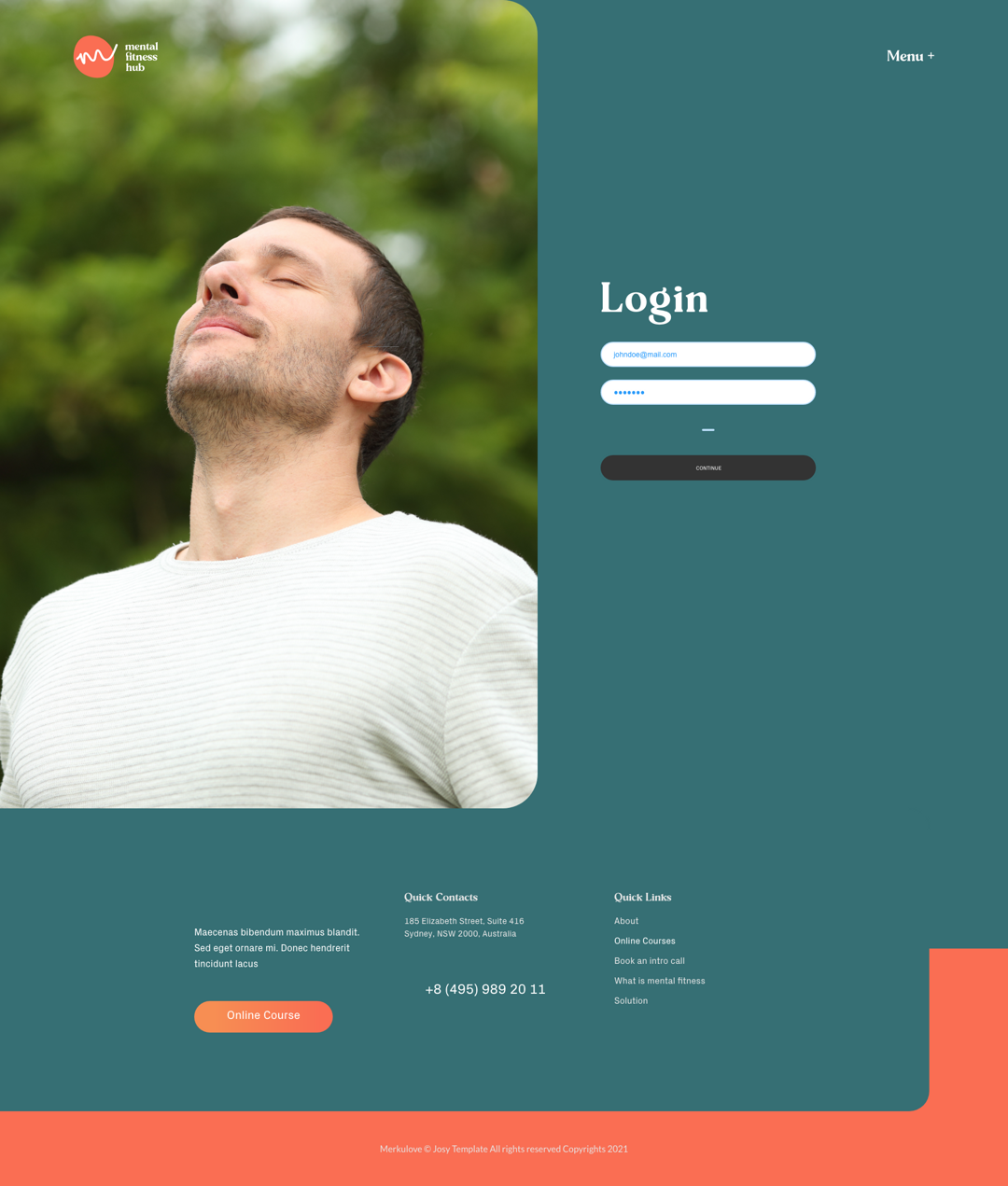
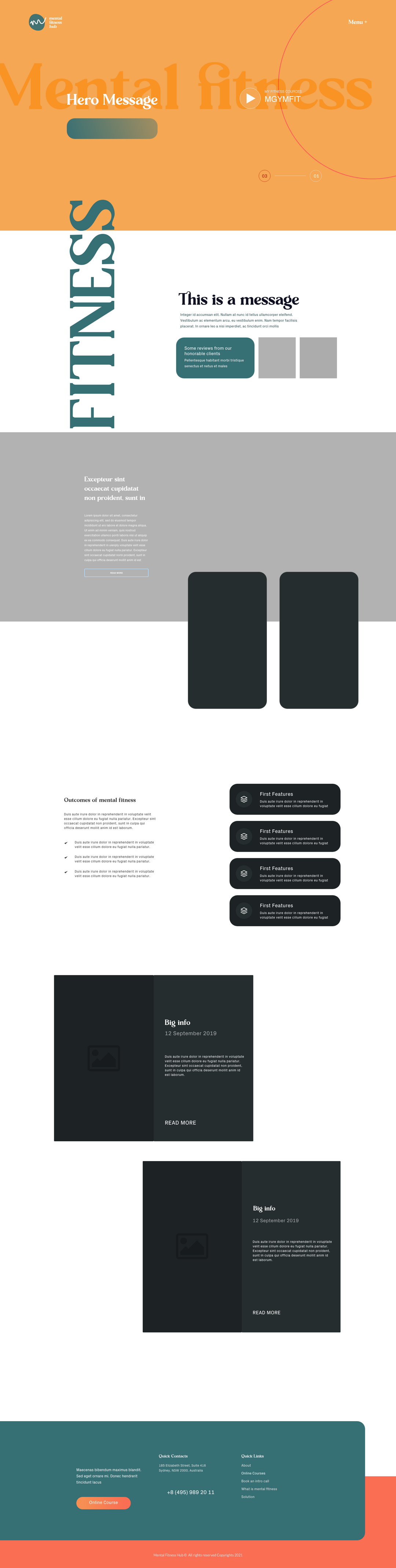
- Designed six full web pages in Adobe XD at full resolution with real content and photography direction: Home, Login, How It Works, Solution, What is Mental Fitness, Contact
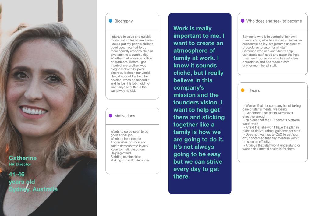
- Turned the strategy personas — including Catherine, the HR Director — into design documents the layouts were built against
How it went
Mental Fitness Hub is a Melbourne-based wellbeing venture bringing mental fitness programmes to organisations. I led the full brand development — running a kick-off workshop, developing the visual identity from scratch, and designing the web experience end-to-end in Adobe XD.
This project started with a workshop. Before any pixels, I ran a brand kick-off session with the founders — Nichole Walker (Director) and Michael Mealy (General Manager) — to establish vision, audience, and tone. Mental fitness, not mental health: the positioning was about building capacity and resilience, not treating illness. That distinction shaped everything.
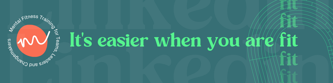
The identity landed in a teal and coral palette — calm without being clinical, energetic without being loud. The logo mark is a simple wave motif that nods to frequency and rhythm, paired with a clean sans-serif wordmark. Brand guidelines were built in multiple formats so they could be used in Keynote, PowerPoint, or handed directly to a developer.
The web design covered six key pages — Home, Login, How It Works, Solution, What is Mental Fitness, and Contact — designed as full-resolution XD layouts with real content and photography direction. The user personas developed during strategy were turned into detailed design documents that shaped every copy and layout decision.