
Health & Wellbeing Tech
Arkeo
AwardBrand, app, web, and strategy for a Transform Award-winning wellbeing platform.
- My role
- Sole creative lead — brand strategy, iOS product design, web, social
What came of it
Best Visual Identity, Lifestyle & Wellbeing sector
Globally judged brand transformation award, won for this project.
Brand, iOS product, web and social from a blank page
Sole creative lead — no other designer on the engagement.
The brief
A pre-launch wellbeing app with no brand, no product design, and a category full of pastel-coloured competitors. The target user was a busy professional who had already tried and abandoned habit tracking at least once. The company needed something to show investors and something to ship.
What I did
- Set the positioning — performance tool rather than gentle wellness nudge — and wrote the strategy the rest of the work hung off
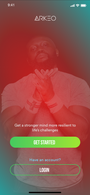
- Built the identity from zero: mark explorations, a deep red and dark palette with green accents, type system, brand guidelines
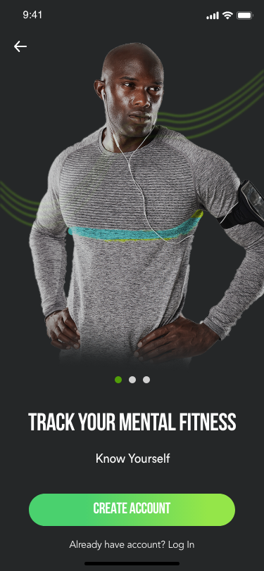
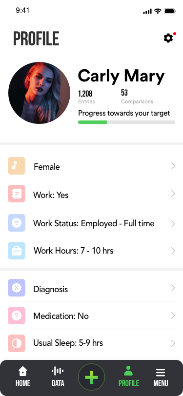
- Designed every screen of the iOS app: welcome, three onboarding steps, sign-up, profile creation, home dashboard, profile
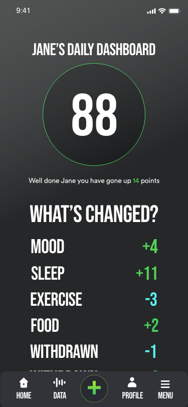
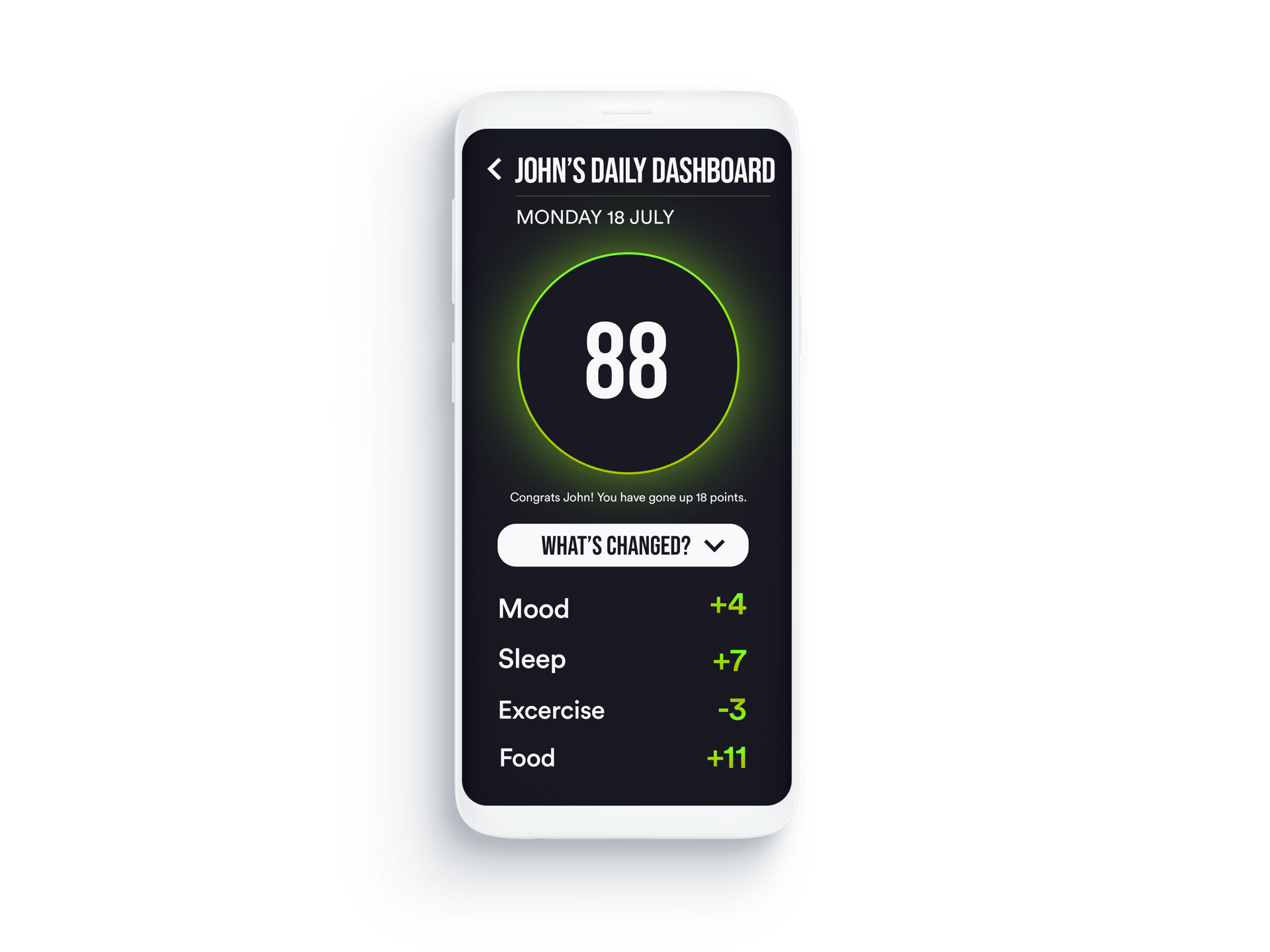
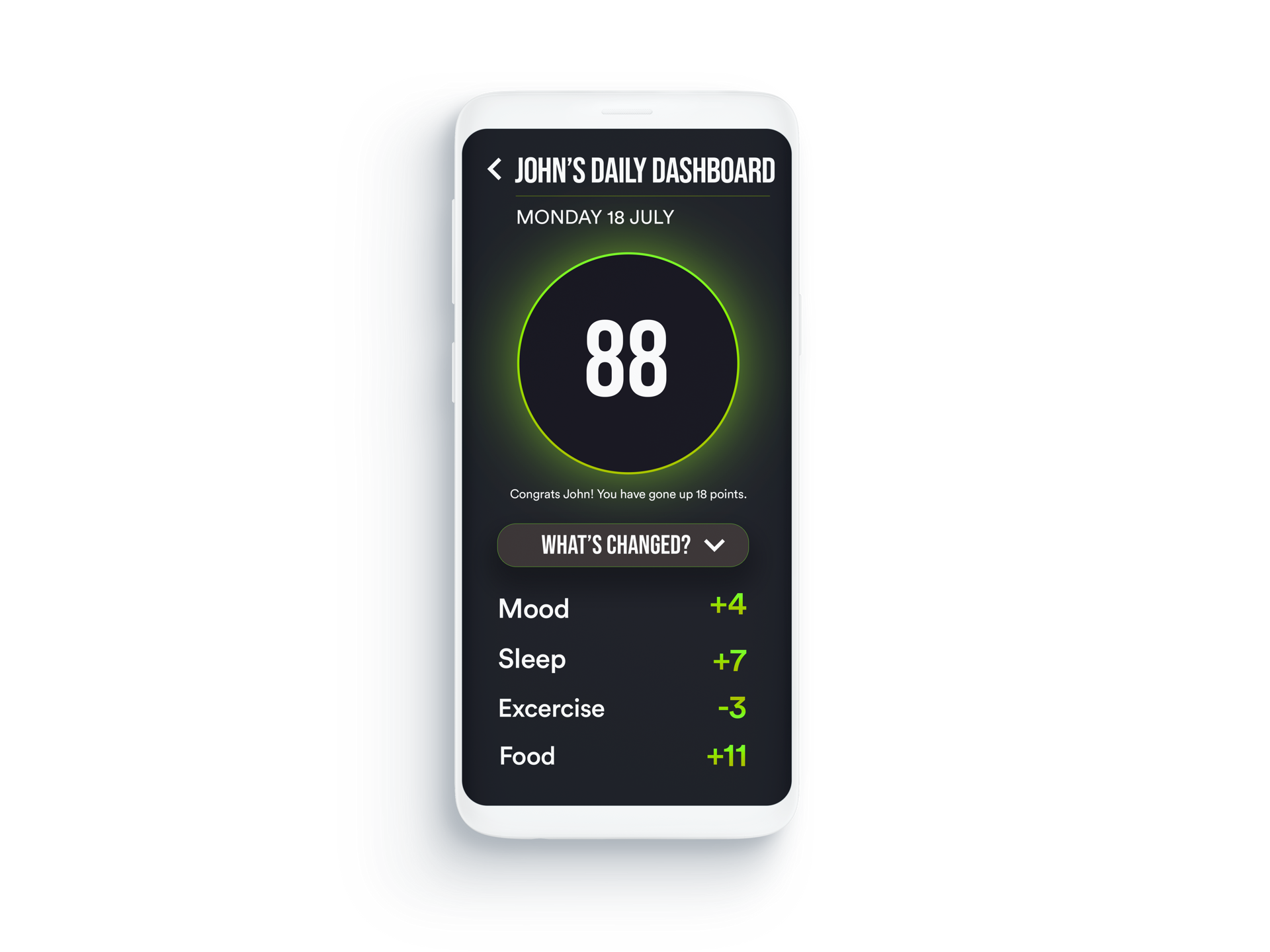
- Designed the daily score dashboard — a circular indicator showing real-time deltas across mood, sleep, exercise and food
- Designed the web presence, the social identity, and the investor deck visuals
- Set the social content strategy and produced the template system the team ran it with
How it went
Arkeo is a wellbeing app built to help people track the lifestyle factors that affect their health and work performance — sleep, food, exercise, mood, and more. I was brought in as the sole creative lead and owned the entire output: brand identity, iOS app design, web design, social media identity, and content strategy.
The brief was ambitious: build a brand and product from scratch for a wellbeing app targeting busy professionals who'd tried and failed at habit tracking before. The category was crowded with pastel-coloured, softly-spoken wellness apps. Arkeo wanted to feel different — more confident, more performance-oriented, darker and more direct.
I started with brand strategy: naming the tension between aspiration and burnout, and positioning Arkeo as a tool that takes performance seriously rather than offering gentle nudges. The visual identity came from that — deep red and dark tones with sharp green accents, bold typography, a mark that felt purposeful rather than decorative.
The app design followed the same logic. The daily score dashboard — a circular indicator showing real-time deltas across Mood, Sleep, Exercise, and Food — needed to feel like a cockpit readout, not a wellness journal. Every screen was designed to give users the information they needed in the fewest possible taps, then get out of the way.
The work was recognised with a Transform Award for Best Visual Identity in the Lifestyle and Wellbeing sector — a globally recognised prize for brand transformation. It remains one of the projects I'm most proud of: strategy, brand, product design, and social all coming from the same creative direction.
Transform Award — Best Visual Identity, Lifestyle & Wellbeing